Welcome
This is my first post on my new Quarto-based blog. I’ll be sharing data visualizations and predictive modeling work here.
Testing the Setup
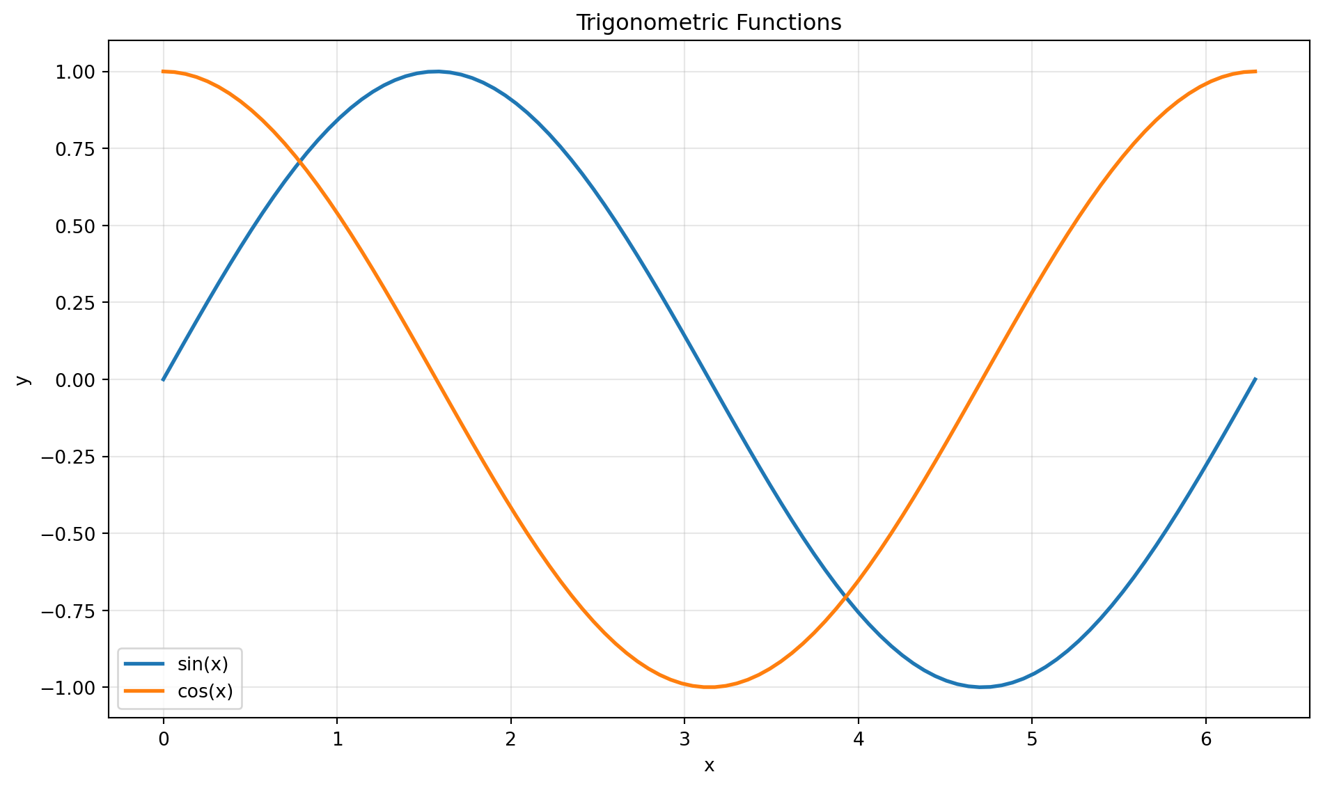
Let me verify that Python code execution and visualization rendering work correctly.
import matplotlib.pyplot as plt
import numpy as np

# Generate sample data
x = np.linspace(0, 2 * np.pi, 100)
y_sin = np.sin(x)
y_cos = np.cos(x)

# Create visualization
fig, ax = plt.subplots(figsize=(10, 6))
ax.plot(x, y_sin, label='sin(x)', linewidth=2)
ax.plot(x, y_cos, label='cos(x)', linewidth=2)
ax.set_xlabel('x')
ax.set_ylabel('y')
ax.set_title('Trigonometric Functions')
ax.legend()
ax.grid(True, alpha=0.3)
plt.tight_layout()
plt.show()
What’s Next
I plan to explore:
- Financial data visualization (particularly nuclear energy stocks)
- Time series analysis
- Predictive modeling techniques
- Interactive visualizations
Stay tuned for more technical content!