2.8%
Headline CPI
2.9%
Core CPI
3.5%
Supercore
2.9%
3-Month Annualized
Data as of January 2026 | Source: Bureau of Labor Statistics via FRED
US consumer prices rose 2.8% year-over-year in January 2026, down from 3.0% in December, the lowest reading since July 2025. Core CPI ticked up to 2.9%. But the real story isn’t in the headline number. It’s in the momentum, the decomposition, and the structural dynamics underneath.
The Python code used to generate each chart is included in this post. Click on any code block to see the full implementation. The complete data pipeline includes:
01_fetch_data.py - Fetches data from FRED (requires free API key)02_clean_data.py - Cleans and computes derived series03_visualizations.py - Generates all charts04_compute_stats.py - Computes summary statisticsAll data sourced from FRED (Federal Reserve Economic Data).
Data as of January 2026 | Source: Bureau of Labor Statistics via FRED
Headline CPI fell to 2.8% in January 2026, down from 3.0% in December 2025. That’s the lowest reading since July 2025.
# =============================================================================
# Exhibit 1: The Headline Story
# =============================================================================

df = df_main.dropna(subset=["headline_yoy"])

fig, ax = plt.subplots(figsize=(10, 5))

# COVID recession shading
ax.axvspan(pd.Timestamp("2020-02-01"), pd.Timestamp("2020-04-01"),
           alpha=0.1, color="#888888", zorder=0)
ax.annotate('COVID\nrecession', xy=(pd.Timestamp("2020-03-01"), 0.5),
            fontsize=8, color='#888888', ha='center', va='bottom')

# Fed 2% target
ax.axhline(y=2.0, color=COLORS['fed_target'], linestyle='--', linewidth=1, alpha=0.7)
ax.text(df.index[-1], 2.15, 'Fed 2% target', fontsize=8, color=COLORS['fed_target'],
        ha='right', va='bottom')

# CPI YoY
ax.plot(df.index, df['headline_yoy'], color=COLORS['primary'], linewidth=2)
ax.fill_between(df.index, df['headline_yoy'], alpha=0.1, color=COLORS['primary'])

# Peak annotation
peak_idx = df['headline_yoy'].idxmax()
peak_val = df['headline_yoy'].max()
ax.annotate(f'Peak: {peak_val:.1f}%', xy=(peak_idx, peak_val),
            xytext=(20, 10), textcoords='offset points',
            fontsize=9, fontweight='bold', color=COLORS['accent'],
            arrowprops=dict(arrowstyle='->', color=COLORS['accent'], lw=0.8))

# Latest value
latest_val = df['headline_yoy'].iloc[-1]
ax.annotate(f'Jan 2026: {latest_val:.1f}%', xy=(df.index[-1], latest_val),
            xytext=(-60, 20), textcoords='offset points',
            fontsize=9, fontweight='bold', color=COLORS['primary'],
            arrowprops=dict(arrowstyle='->', color=COLORS['primary'], lw=0.8))

ax.set_ylabel('Year-over-Year Change (%)')
ax.xaxis.set_major_formatter(mdates.DateFormatter('%Y'))
ax.xaxis.set_major_locator(mdates.YearLocator())
plt.tight_layout()
plt.show()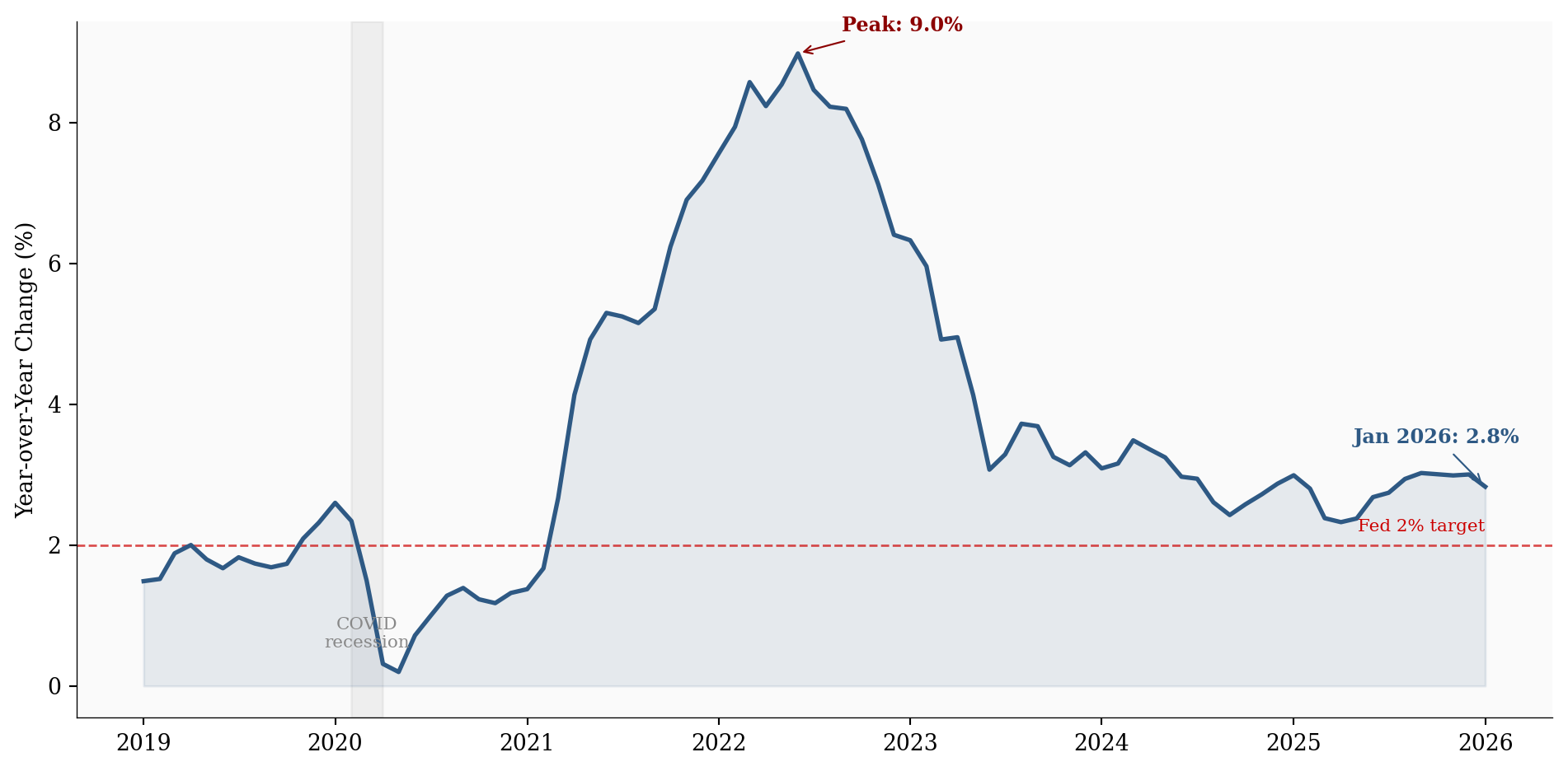
The trend is clear: inflation has been on a slow, grinding path lower since the post-pandemic peak. But the headline number can be misleading: it’s a trailing 12-month average that smooths over what’s actually happening right now.
Two measures matter more than headline CPI for understanding where inflation is actually headed: core CPI (excluding volatile food and energy) and supercore (services excluding energy, which the Fed closely watches for underlying price pressure).
# =============================================================================
# Exhibit 2: Headline vs Core vs Supercore
# =============================================================================

df = df_main.dropna(subset=['headline_yoy', 'core_yoy', 'supercore_yoy'])

fig, ax = plt.subplots(figsize=(10, 5))

ax.axhline(y=2.0, color=COLORS['fed_target'], linestyle='--', linewidth=1, alpha=0.5)

ax.plot(df.index, df['headline_yoy'], color=COLORS['primary'], linewidth=2,
        label='Headline CPI')
ax.plot(df.index, df['core_yoy'], color=COLORS['accent'], linewidth=2,
        label='Core CPI (ex food & energy)')
ax.plot(df.index, df['supercore_yoy'], color=COLORS['secondary'], linewidth=2,
        label='Supercore (services ex energy)')

# Direct labels at end of each line
for col, color, label in [
    ('headline_yoy', COLORS['primary'], 'Headline'),
    ('core_yoy', COLORS['accent'], 'Core'),
    ('supercore_yoy', COLORS['secondary'], 'Supercore'),
]:
    last_val = df[col].iloc[-1]
    ax.text(df.index[-1], last_val, f'  {label}: {last_val:.1f}%',
            fontsize=9, color=color, va='center', fontweight='bold')

ax.set_ylabel('Year-over-Year Change (%)')
ax.legend(loc='upper right', fontsize=8)
ax.xaxis.set_major_formatter(mdates.DateFormatter('%Y'))
ax.set_xlim(right=df.index[-1] + pd.Timedelta(days=180))
plt.tight_layout()
plt.show()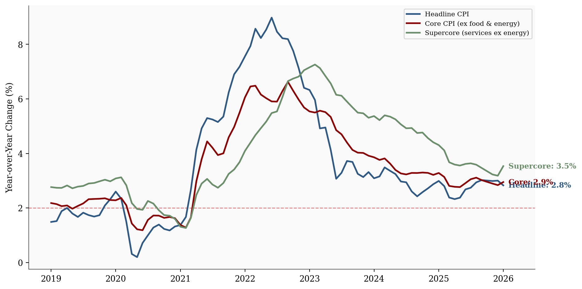
Core CPI at 2.9% is still above the Fed’s target. This matters because core strips out the noise of gas prices and grocery bills, revealing the underlying inflation trend.
The most important chart most people never see: inflation momentum. Instead of looking at trailing 12-month averages, we can annualize shorter windows (1-month, 3-month, 6-month) to see whether inflation is accelerating or decelerating right now.
# =============================================================================
# Exhibit 3: Inflation Momentum
# =============================================================================

df = df_main.dropna(subset=['headline_yoy', 'headline_3m_ann']).copy()
df = df[df.index >= '2022-01-01']

fig, ax = plt.subplots(figsize=(10, 5))

ax.axhline(y=2.0, color=COLORS['fed_target'], linestyle='--', linewidth=1, alpha=0.5)

ax.plot(df.index, df['headline_yoy'], color=COLORS['primary'], linewidth=2.5,
        label='12-month YoY', zorder=3)
ax.plot(df.index, df['headline_6m_ann'], color=COLORS['secondary'], linewidth=1.5,
        alpha=0.8, label='6-month annualized')
ax.plot(df.index, df['headline_3m_ann'], color=COLORS['accent'], linewidth=1.5,
        alpha=0.8, label='3-month annualized')
ax.plot(df.index, df['headline_1m_ann'], color=COLORS['light'], linewidth=1,
        alpha=0.6, label='1-month annualized')

for col, color, label in [
    ('headline_yoy', COLORS['primary'], '12m'),
    ('headline_6m_ann', COLORS['secondary'], '6m'),
    ('headline_3m_ann', COLORS['accent'], '3m'),
]:
    last_val = df[col].iloc[-1]
    ax.text(df.index[-1], last_val, f'  {label}: {last_val:.1f}%',
            fontsize=8, color=color, va='center', fontweight='bold')

ax.set_ylabel('Annualized Rate (%)')
ax.legend(loc='upper right', fontsize=8)
ax.xaxis.set_major_formatter(mdates.DateFormatter('%b\n%Y'))
ax.xaxis.set_major_locator(mdates.MonthLocator(interval=3))
ax.set_xlim(right=df.index[-1] + pd.Timedelta(days=90))
plt.tight_layout()
plt.show()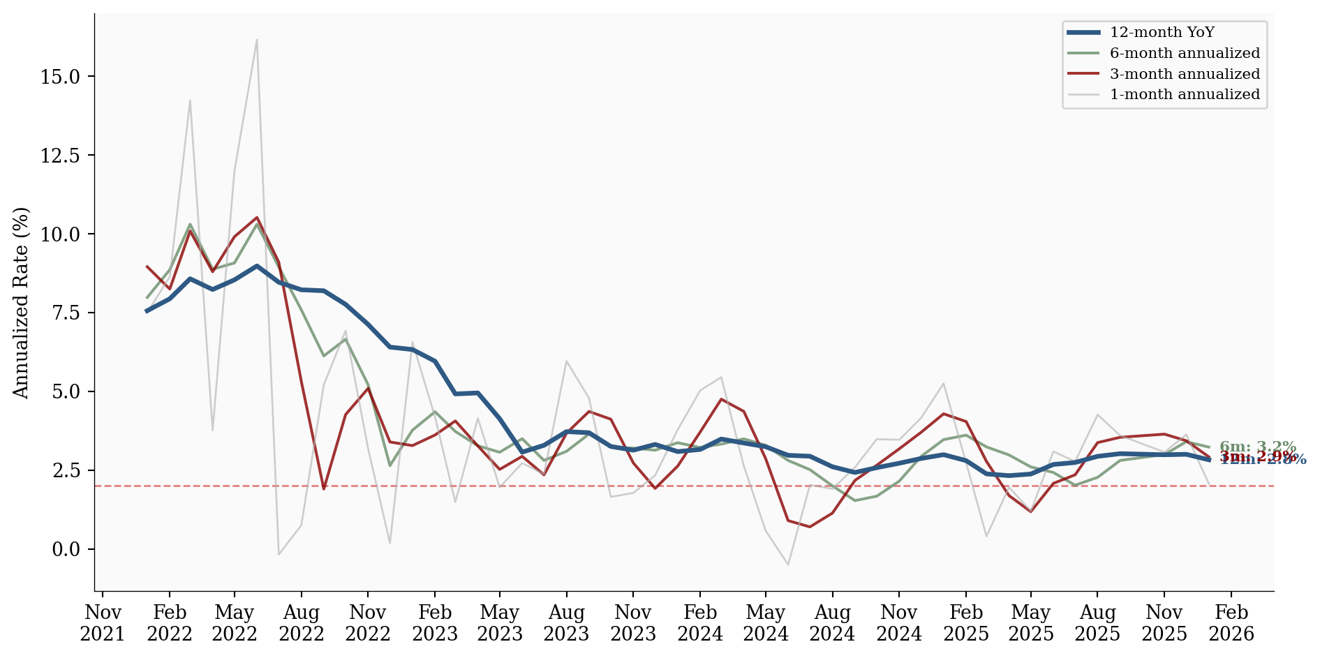
The 3-month annualized rate is 2.9%, which is 0.1pp above the 12-month rate. This suggests near-term price pressures are running hotter than the trailing average.
Not all prices move together. Breaking down inflation into its major components reveals where the cooling is coming from, and where stickiness remains.
# =============================================================================
# Exhibit 4: Component Radar Chart
# =============================================================================

from matplotlib.patches import FancyBboxPatch

component_names = ['Shelter', 'Food', 'Energy', 'Medical', 'Transport.', 'Apparel']
component_cols = ['shelter_yoy', 'food_yoy', 'energy_yoy', 'medical_yoy',
                  'transportation_yoy', 'apparel_yoy']

# Pick 4 time snapshots (January of each year where available)
snapshots = {}
for year in [2023, 2024, 2025, 2026]:
    target = f'{year}-01'
    matches = df_comp[df_comp.index.strftime('%Y-%m') == target]
    if len(matches) > 0:
        snapshots[f'Jan {year}'] = matches.iloc[0]

# Radar chart setup
N = len(component_names)
angles = np.linspace(0, 2 * np.pi, N, endpoint=False).tolist()
angles += angles[:1]  # Close the polygon

fig, ax = plt.subplots(figsize=(8, 8), subplot_kw=dict(polar=True))

snapshot_styles = {
    'Jan 2023': {'color': COLORS['light'], 'ls': '--', 'lw': 1.5, 'alpha': 0.6},
    'Jan 2024': {'color': COLORS['secondary'], 'ls': '--', 'lw': 1.5, 'alpha': 0.7},
    'Jan 2025': {'color': COLORS['primary'], 'ls': '-', 'lw': 2, 'alpha': 0.8},
    'Jan 2026': {'color': COLORS['accent'], 'ls': '-', 'lw': 2.5, 'alpha': 1.0},
}

for label, row in snapshots.items():
    values = [row[col] for col in component_cols]
    values += values[:1]  # Close
    style = snapshot_styles.get(label, {'color': 'gray', 'ls': '-', 'lw': 1, 'alpha': 0.5})
    ax.plot(angles, values, label=label, **style)
    if label == 'Jan 2026':
        ax.fill(angles, values, alpha=0.08, color=style['color'])

# Highlight energy axis
energy_idx = component_names.index('Energy')
energy_angle = angles[energy_idx]
ax.plot([energy_angle, energy_angle], [0, ax.get_ylim()[1]], color=COLORS['secondary'],
        linewidth=2, alpha=0.3, zorder=0)

ax.set_xticks(angles[:-1])
ax.set_xticklabels(component_names, fontsize=10)
ax.set_title('Inflation by Component: How the Shape Has Changed', pad=20)
ax.legend(loc='upper right', bbox_to_anchor=(1.3, 1.1), fontsize=9)

plt.tight_layout()
plt.show()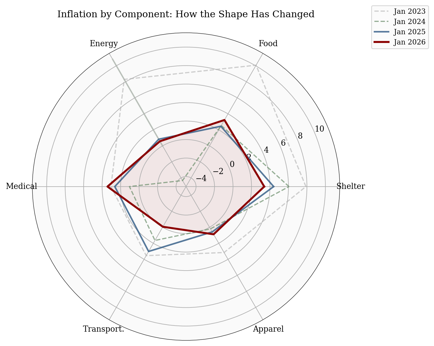
The radar chart shows how the inflation “footprint” has shrunk over the past three years. Energy (highlighted axis) has collapsed from double-digit increases to near zero. Shelter remains the stubborn outlier, still elevated while other categories have normalized. Transportation has turned negative, reflecting falling used car prices.
The story is clear: shelter remains the single largest contributor to above-target inflation. At 3.4% YoY, it accounts for roughly 1.2pp of the headline number.
Shelter is the key to the “last mile” of disinflation, and there’s reason to believe it will keep falling.
# =============================================================================
# Exhibit 5a: Shelter vs Headline - Showing the Lag
# =============================================================================

df_sh = pd.read_csv("data/clean/shelter_detail.csv", index_col=0, parse_dates=True)
df_sh = df_sh.dropna(subset=['shelter_yoy', 'headline_yoy'])

fig, ax = plt.subplots(figsize=(10, 5))

ax.axhline(y=2.0, color=COLORS['fed_target'], linestyle='--', linewidth=1, alpha=0.5)

ax.plot(df_sh.index, df_sh['headline_yoy'], color=COLORS['primary'], linewidth=2,
        label='Headline CPI')
ax.plot(df_sh.index, df_sh['shelter_yoy'], color=COLORS['accent'], linewidth=2.5,
        label='Shelter CPI')

# Annotate the lag with arrows between peaks
headline_peak = df_sh['headline_yoy'].idxmax()
shelter_peak = df_sh['shelter_yoy'].idxmax()
ax.annotate('', xy=(shelter_peak, df_sh['shelter_yoy'].max() + 0.3),
            xytext=(headline_peak, df_sh['shelter_yoy'].max() + 0.3),
            arrowprops=dict(arrowstyle='<->', color=COLORS['neutral'], lw=1.5))
lag_months = (shelter_peak - headline_peak).days // 30
ax.text(headline_peak + (shelter_peak - headline_peak) / 2,
        df_sh['shelter_yoy'].max() + 0.6,
        f'~{lag_months}-month lag', ha='center', fontsize=9,
        color=COLORS['neutral'], fontweight='bold')

# Direct labels
for col, color, label in [
    ('headline_yoy', COLORS['primary'], 'Headline'),
    ('shelter_yoy', COLORS['accent'], 'Shelter'),
]:
    last_val = df_sh[col].iloc[-1]
    ax.text(df_sh.index[-1], last_val, f'  {label}: {last_val:.1f}%',
            fontsize=9, color=color, va='center', fontweight='bold')

ax.set_ylabel('Year-over-Year Change (%)')
ax.legend(loc='upper left', fontsize=8)
ax.xaxis.set_major_formatter(mdates.DateFormatter('%Y'))
ax.set_xlim(right=df_sh.index[-1] + pd.Timedelta(days=120))
plt.tight_layout()
plt.show()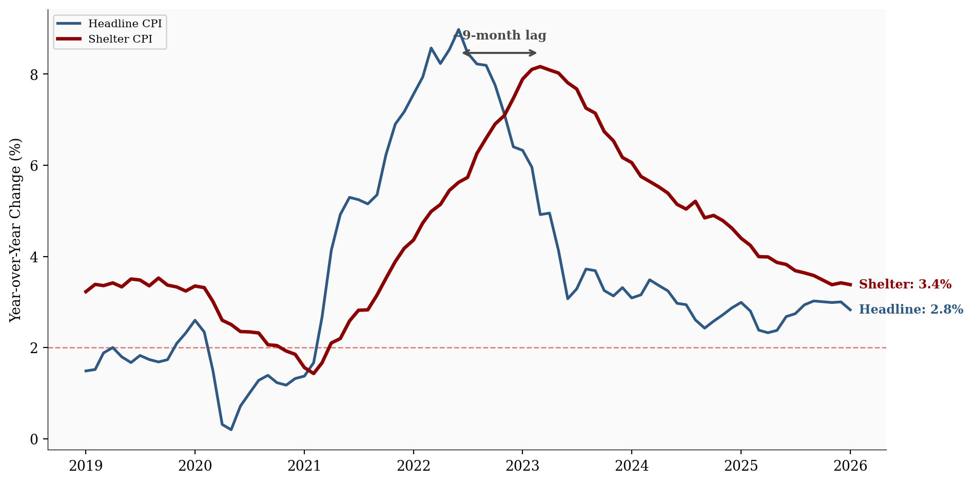
The chart above makes the lag crystal clear: headline CPI peaked months before shelter CPI did. The BLS shelter measure reflects the average rent across all existing leases, not just new ones, so it takes 12-18 months for market-rate changes to fully flow through.
# =============================================================================
# Exhibit 5b: Shelter Subcategories
# =============================================================================

fig, ax = plt.subplots(figsize=(10, 5))

ax.axhline(y=2.0, color=COLORS['fed_target'], linestyle='--', linewidth=1, alpha=0.5)

ax.plot(df_sh.index, df_sh['shelter_yoy'], color=COLORS['accent'], linewidth=2.5,
        label='Shelter (total)', alpha=0.5)
ax.plot(df_sh.index, df_sh['oer_yoy'], color=COLORS['primary'], linewidth=2,
        label="Owners' Equiv. Rent (OER)")
ax.plot(df_sh.index, df_sh['rent_yoy'], color=COLORS['secondary'], linewidth=2,
        label='Rent of Primary Residence')

# Direct labels
for col, color, label in [
    ('oer_yoy', COLORS['primary'], 'OER'),
    ('rent_yoy', COLORS['secondary'], 'Rent'),
    ('shelter_yoy', COLORS['accent'], 'Shelter'),
]:
    last_val = df_sh[col].iloc[-1]
    ax.text(df_sh.index[-1], last_val, f'  {label}: {last_val:.1f}%',
            fontsize=9, color=color, va='center', fontweight='bold')

ax.set_ylabel('Year-over-Year Change (%)')
ax.legend(loc='upper right', fontsize=8)
ax.xaxis.set_major_formatter(mdates.DateFormatter('%Y'))
ax.set_xlim(right=df_sh.index[-1] + pd.Timedelta(days=120))
plt.tight_layout()
plt.show()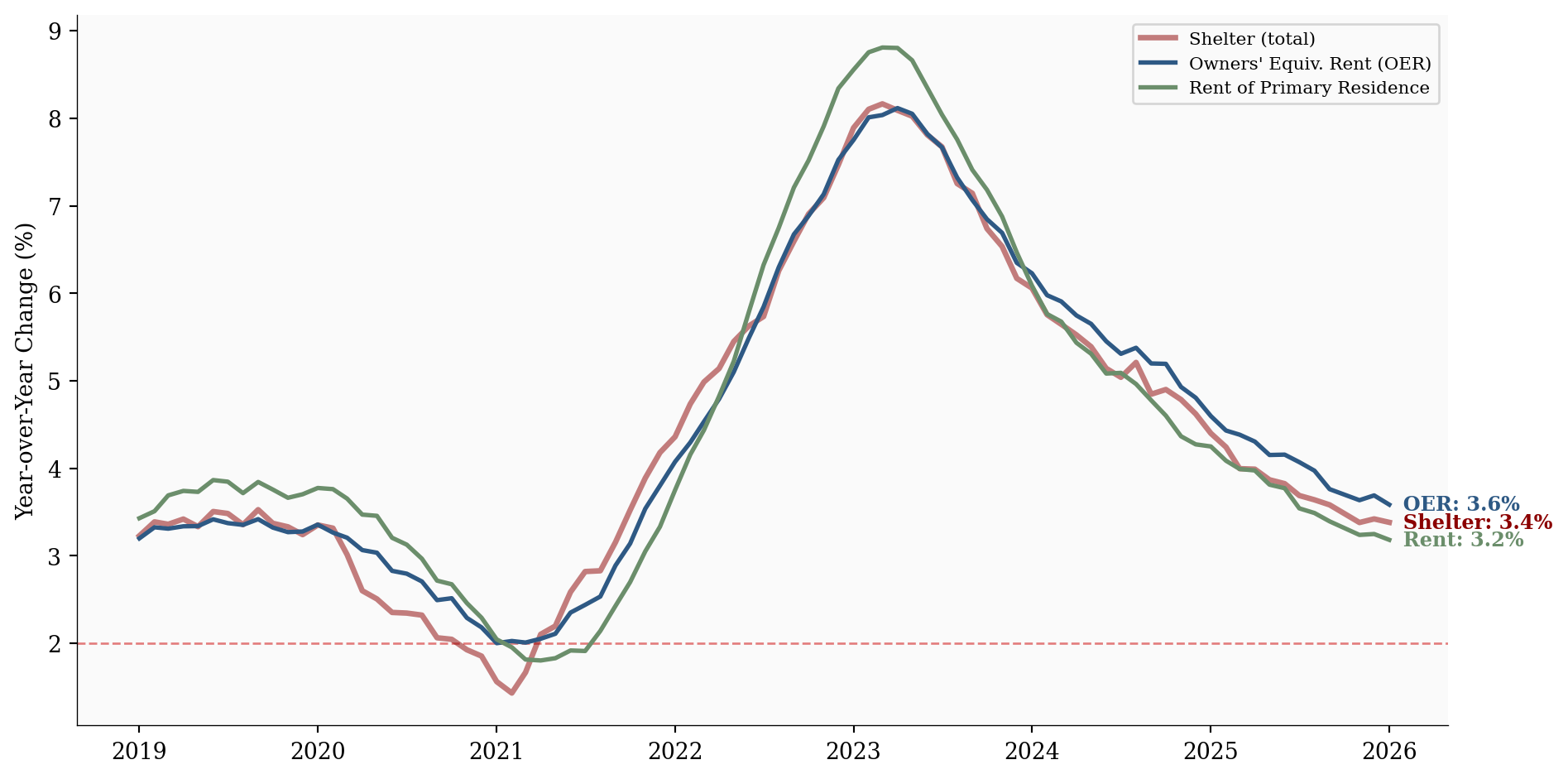
Shelter peaked at 8.2% in March 2023 and has been falling steadily since. At 3.4% now, both OER and primary rent are on a clear downward trajectory. Private-sector data on new tenant rents (from Zillow, Apartment List, and others) has been running near or below the pre-pandemic trend for months, meaning further shelter disinflation is already baked into the pipeline.
Is the cooling concentrated in a few volatile categories, or is it broad-based? Two sets of measures help answer this question.
The Atlanta Fed splits the CPI basket into sticky items (things that change price infrequently, like rent, insurance, and education) and flexible items (things that change frequently, like gas, food, and airfares).
# =============================================================================
# Exhibit 6: Sticky vs Flexible CPI
# =============================================================================

df = df_alt.dropna(subset=['sticky_cpi', 'flexible_cpi']).copy()

fig, ax = plt.subplots(figsize=(10, 5))

ax.axhline(y=2.0, color=COLORS['fed_target'], linestyle='--', linewidth=1, alpha=0.5)

ax.plot(df.index, df['sticky_cpi'], color=COLORS['accent'], linewidth=2.5,
        label='Sticky CPI (rent, insurance, education)')
ax.plot(df.index, df['flexible_cpi'], color=COLORS['primary'], linewidth=2,
        label='Flexible CPI (gas, food, airfares)')

for col, color, label in [
    ('sticky_cpi', COLORS['accent'], 'Sticky'),
    ('flexible_cpi', COLORS['primary'], 'Flexible'),
]:
    last_val = df[col].iloc[-1]
    ax.text(df.index[-1], last_val, f'  {label}: {last_val:.1f}%',
            fontsize=9, color=color, va='center', fontweight='bold')

ax.set_ylabel('Year-over-Year Change (%)')
ax.legend(loc='upper right', fontsize=8)
ax.xaxis.set_major_formatter(mdates.DateFormatter('%Y'))
ax.set_xlim(right=df.index[-1] + pd.Timedelta(days=180))
plt.tight_layout()
plt.show()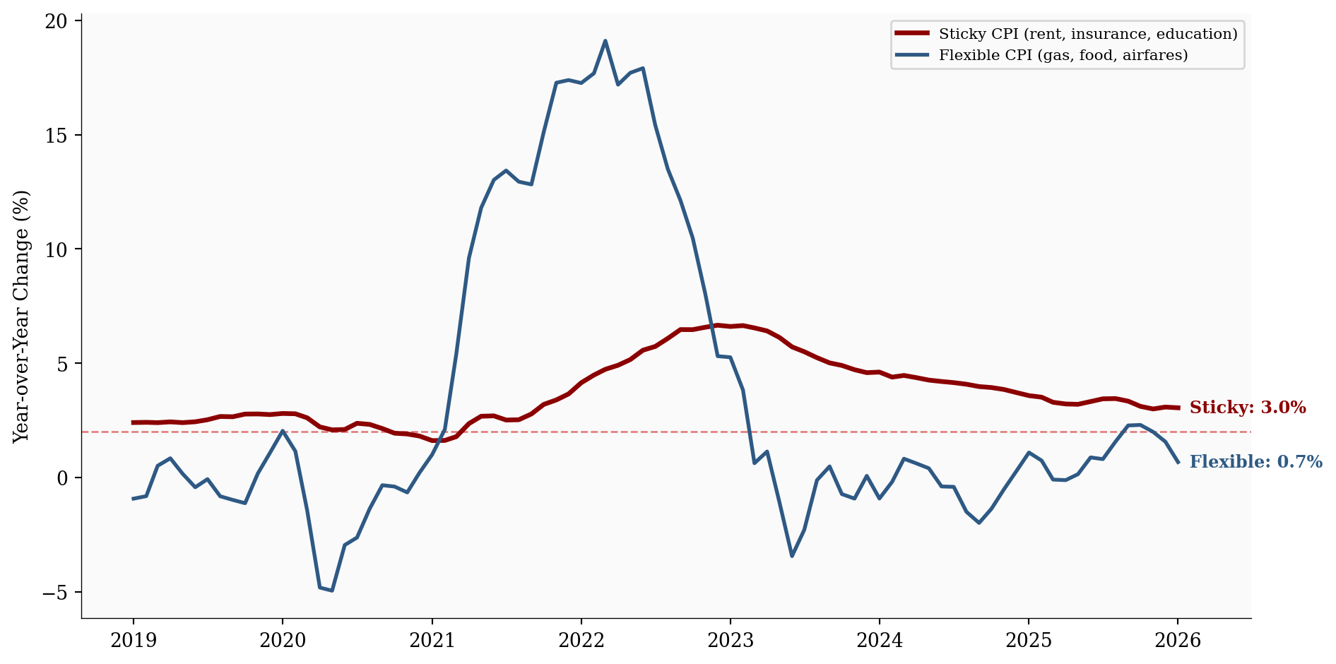
Flexible CPI at 0.7% has essentially normalized. The remaining inflation is concentrated in sticky prices at 3.0%, but these too are on a clear downtrend.
The Cleveland Fed’s median CPI and 16% trimmed-mean CPI strip out the tails of the price-change distribution. When these measures fall, it means disinflation is broad-based, not driven by a few outlier categories collapsing.
# =============================================================================
# Exhibit 7: Median & Trimmed-Mean CPI
# =============================================================================

df = df_alt.dropna(subset=['median_cpi', 'trimmed_mean_cpi']).copy()

fig, ax = plt.subplots(figsize=(10, 5))

ax.axhline(y=2.0, color=COLORS['fed_target'], linestyle='--', linewidth=1, alpha=0.5)

# Headline as light reference
ax.plot(df_main.index, df_main['headline_yoy'], color=COLORS['light'], linewidth=1,
        alpha=0.6, label='Headline CPI (reference)')

ax.plot(df.index, df['median_cpi'], color=COLORS['accent'], linewidth=2.5,
        label='Median CPI')
ax.plot(df.index, df['trimmed_mean_cpi'], color=COLORS['primary'], linewidth=2,
        label='16% Trimmed Mean CPI')

for col, color, label in [
    ('median_cpi', COLORS['accent'], 'Median'),
    ('trimmed_mean_cpi', COLORS['primary'], 'Trimmed Mean'),
]:
    last_val = df[col].iloc[-1]
    ax.text(df.index[-1], last_val, f'  {label}: {last_val:.1f}%',
            fontsize=9, color=color, va='center', fontweight='bold')

ax.set_ylabel('Year-over-Year Change (%)')
ax.legend(loc='upper right', fontsize=8)
ax.xaxis.set_major_formatter(mdates.DateFormatter('%Y'))
ax.set_xlim(right=df.index[-1] + pd.Timedelta(days=180))
plt.tight_layout()
plt.show()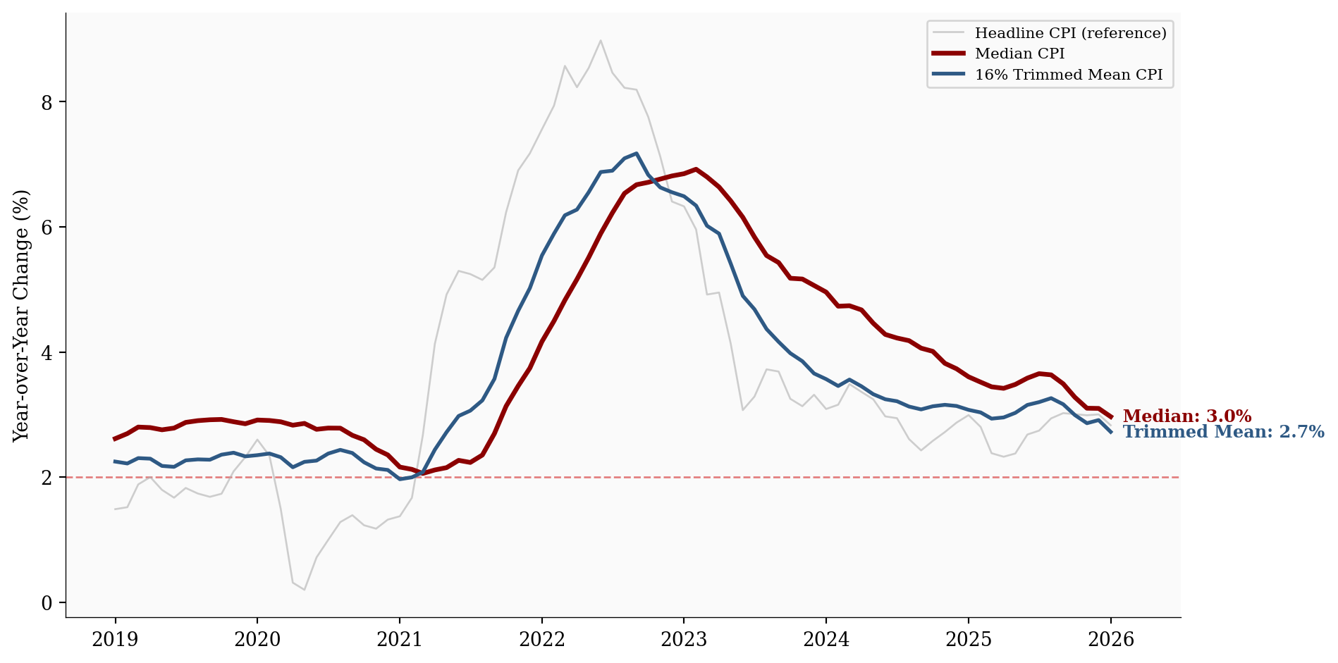
Median CPI is at 3.0% and trimmed-mean at 2.7%. Both are declining, confirming this isn’t just energy prices doing the heavy lifting.
Finally, where does 2.8% sit in the long arc of American inflation?
# =============================================================================
# Exhibit 8: The Long View
# =============================================================================

df = df_long.dropna(subset=['headline_yoy'])

fig, ax = plt.subplots(figsize=(10, 5))

ax.axhline(y=2.0, color=COLORS['fed_target'], linestyle='--', linewidth=1, alpha=0.4)

# Recession shading
long_recessions = [
    ('1969-12-01', '1970-11-01'), ('1973-11-01', '1975-03-01'),
    ('1980-01-01', '1980-07-01'), ('1981-07-01', '1982-11-01'),
    ('1990-07-01', '1991-03-01'), ('2001-03-01', '2001-11-01'),
    ('2007-12-01', '2009-06-01'), ('2020-02-01', '2020-04-01'),
]
for start, end in long_recessions:
    ax.axvspan(pd.Timestamp(start), pd.Timestamp(end), alpha=0.08, color='#888888')

ax.plot(df.index, df['headline_yoy'], color=COLORS['primary'], linewidth=1.5)
ax.fill_between(df.index, df['headline_yoy'], alpha=0.1, color=COLORS['primary'])

# Historical annotations
annotations = [
    (pd.Timestamp('1974-12-01'), 12.3, 'Oil Shock I'),
    (pd.Timestamp('1980-03-01'), 14.8, 'Volcker Era Peak'),
    (pd.Timestamp('2008-07-01'), 5.6, 'GFC'),
    (pd.Timestamp('2022-06-01'), 9.1, 'Post-COVID Peak'),
]
for date, yval, label in annotations:
    ax.annotate(label, xy=(date, yval),
                xytext=(0, 12), textcoords='offset points',
                fontsize=8, ha='center', color=COLORS['neutral'], fontweight='bold',
                bbox=dict(boxstyle='round,pad=0.2', facecolor='white',
                         edgecolor='none', alpha=0.8))

latest_val = df['headline_yoy'].iloc[-1]
ax.annotate(f'Jan 2026:\n{latest_val:.1f}%', xy=(df.index[-1], latest_val),
            xytext=(-50, 30), textcoords='offset points',
            fontsize=9, fontweight='bold', color=COLORS['primary'],
            arrowprops=dict(arrowstyle='->', color=COLORS['primary'], lw=0.8))

ax.set_ylabel('Year-over-Year Change (%)')
ax.xaxis.set_major_formatter(mdates.DateFormatter('%Y'))
ax.xaxis.set_major_locator(mdates.YearLocator(10))
plt.tight_layout()
plt.show()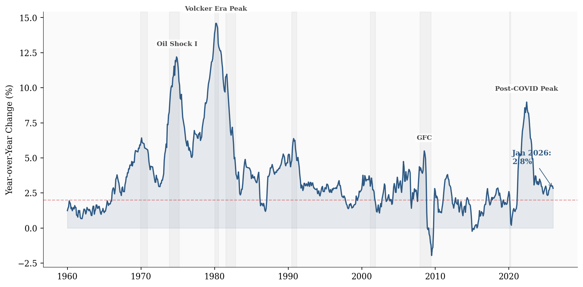
In historical context, 2.8% is utterly unremarkable. The long-run average since 1960 is 3.7%, and the post-COVID spike of 14.6% in March 1980 now looks like an acute episode, not a regime change. The “Great Moderation” of inflation that characterized the 1990s-2010s appears to be reasserting itself.
For the Fed: The data gives the Federal Open Market Committee (FOMC) more room to cut rates, but the sticky-price holdouts (shelter, insurance) mean they won’t rush. Markets are pricing in further easing, but the pace will depend on whether the 3-month momentum continues to run below the 12-month average.
For consumers: The relief is real but gradual. Prices aren’t falling; they’re rising more slowly. Shelter costs are still elevated, and services inflation remains above the Fed’s target. The squeeze on household budgets is easing, not ending.
For markets: The disinflation trend supports risk assets and argues against a second inflation wave. The breadth of the cooling (confirmed by median and trimmed-mean measures) makes this more durable than if it were driven by a single volatile category.
All data sourced from FRED (Federal Reserve Economic Data):
| Series | Description | Source |
|---|---|---|
| CPIAUCSL | CPI-U All Items | BLS |
| CPILFESL | CPI-U Less Food & Energy | BLS |
| CUSR0000SAH1 | Shelter | BLS |
| CUUR0000SASLE | Services Less Energy | BLS |
| STICKCPIM157SFRBATL | Sticky CPI | Atlanta Fed |
| FLEXCPIM157SFRBATL | Flexible CPI | Atlanta Fed |
| MEDCPIM158SFRBCLE | Median CPI | Cleveland Fed |
| TRMMEANCPIM158SFRBCLE | 16% Trimmed Mean CPI | Cleveland Fed |
Component weights are approximate CPI-U weights as of December 2025. Momentum rates are computed by annualizing the N-month price change: \left(\frac{P_t}{P_{t-N}}\right)^{12/N} - 1.
Data current as of February 16, 2026.