May 2026 Jobs Report: Labor Market Stabilization at +172k
May 2026 payrolls printed +172k, well above the +80k consensus but within sampling error, with gains concentrated in three acyclical sectors (health care, government, leisure). Full dashboard analysis of the trend, sectors, wages, JOLTS, claims, and implications for the June FOMC.
economics
labor market
labor market breadth
data visualization
federal reserve
Author
Yoram Gilboa
Published
June 6, 2026
Executive summary
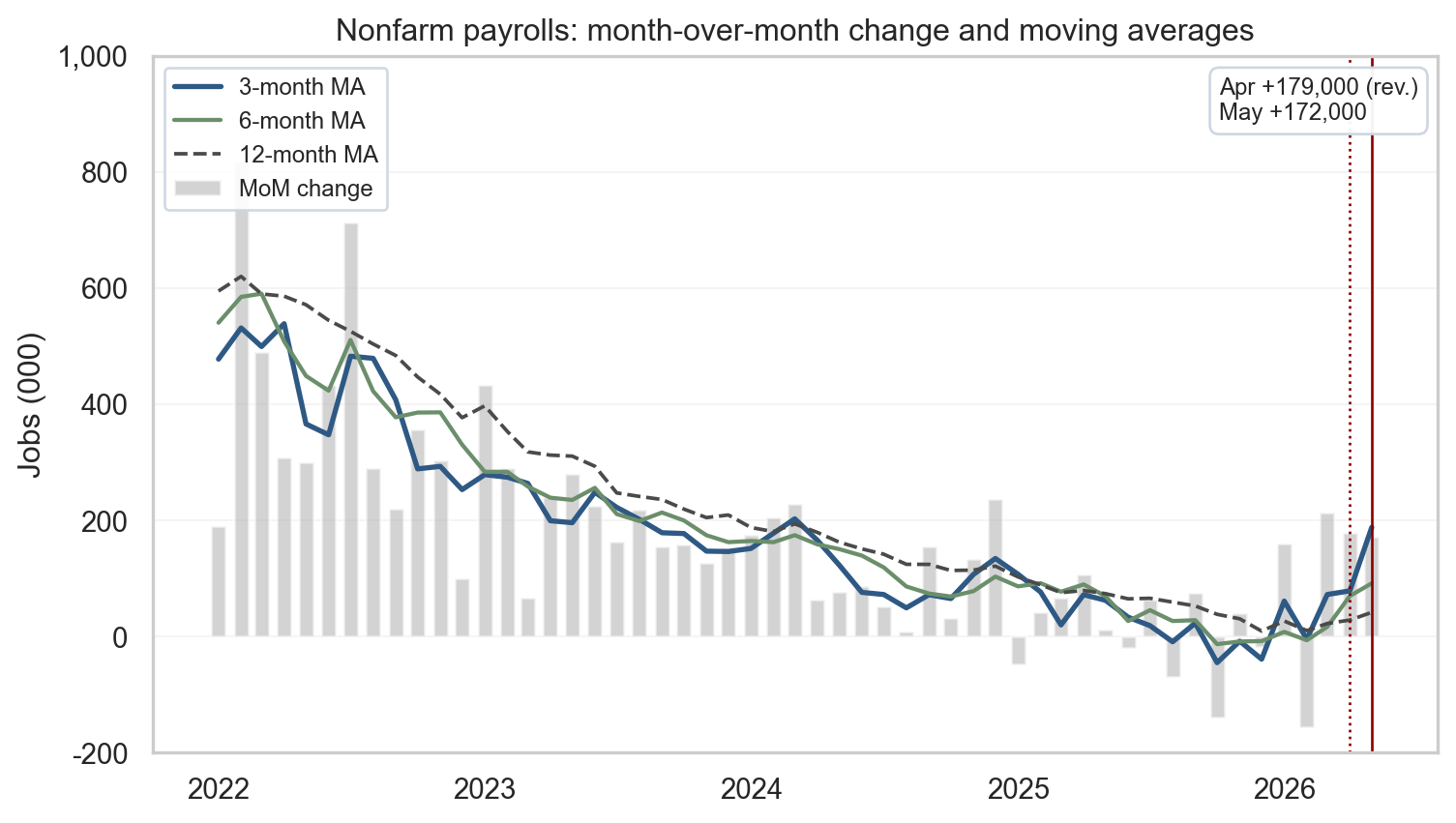
The May 2026 Employment Situation release printed +172,000 nonfarm payrolls, well above the consensus near +80,000, though the beat sits well within the CES survey’s standard 90% confidence interval of roughly ±130,000 jobs and is therefore not statistically distinguishable from the median estimate. The unemployment rate held at 4.3% for the fourth consecutive month. The household survey added +149,000 employed persons, directionally consistent with the establishment survey but too noisy to count as independent confirmation. The revisions are notable: April was revised up to +179,000 from an initial print of +115,000, a +64,000 lift - and revisions matter precisely because the first print is the noisiest one. The figure in the next two releases uses meaningfully more sample and is materially more reliable, so the disciplined read weights revisions more heavily than fresh prints. The three-month average now sits at +188,000, well above the six-month pace of +92,000 and the twelve-month pace of +42,000, though part of that gap may close as recent prints are revised. Full sampling-error and revision context is in the callout below. The clean read on the cycle: a labor market that has stabilized at a slower pace than 2023-24 but has not broken, headed into the June 11 CPI release and the June 16-17 FOMC.
NoteNote on data
Headline payroll, unemployment, average hourly earnings, household-survey employment, and industry-detail values are computed from the FRED-cached BLS series in this post’s data/ directory and recorded in stats/summary_stats.json as the single source of truth used by the prose, the executive-summary cards, and the figure annotations. The initial April print (+115,000) and the consensus estimate (+80,000) are taken from the prior May 8, 2026 release and the Dow Jones pre-release survey of economists, respectively. All FRED-pulled series (PAYEMS, UNRATE, CIVPART, EMRATIO, JTSJOL, JTSQUR, ICSA, CPIAUCSL, OPHNFB, ULCNFB, USREC, ADPMNUSNERSA, CE16OV, state UR, and the sector employment aliases listed in the sources table) are retrieved with fredapi when FRED_API_KEY is set, otherwise via the FRED graph CSV export cached in data/. The ADP series is rescaled from persons to thousands so its month-over-month changes line up with CES private employment. Recession shading uses the monthly USREC indicator and is illustrative rather than an official NBER chronology graphic. Data current as of June 6, 2026.
NoteInterpreting monthly labor data
The headline payroll change from the CES (establishment) survey carries a 90% confidence interval of approximately ±130,000 jobs. That means the +172,000 print and the +80,000 consensus estimate are not statistically distinguishable from each other in any single month. The household survey (CPS) is even noisier: its 90% confidence interval on the monthly employment change is roughly ±500,000, so the +149,000 household figure is consistent with anything from a large decline to a large gain. This is why the post emphasizes trend reads (3/6/12-month moving averages) over any single month’s headline.
Revisions add a second layer of uncertainty - but they also progressively resolve it. Initial CES prints are based on roughly 40% of the final establishment sample. The first revision (released one month later) typically brings that to about 75%, and the second revision (two months after the initial) brings it to about 95%. Because the standard error of a sample estimate shrinks as sample coverage grows, the confidence interval on a payroll number tightens with each revision: the figure reported two months after its initial print is materially more reliable than the initial. The practical takeaway is to weight revised numbers more heavily than fresh prints and avoid overreacting to any single first release - the second-revision figure, two months later, is closer to the truth.
Beyond monthly revisions, the annual CES benchmark reconciles survey-based estimates against the near-universe QCEW (Quarterly Census of Employment and Wages). The 2024 preliminary benchmark revision was approximately -818,000 jobs, meaning the BLS had materially overestimated payroll levels for that period. This is a separate and larger class of revision risk than the two monthly revisions; the direction and magnitude of future benchmarks is not predictable from current data.
In this post, single-month readings (the consensus beat, the household survey change) are reported because they are the standard currency of jobs-day coverage, but the analytical weight is on the trend. Readers should hold any individual month’s numbers lightly.
Nonfarm Payrolls
+172,000
May 2026 vs. +80,000 consensus
Unemployment Rate
4.3%
Unchanged from April
April Revision
+64k
to +179,000 from +115,000
May 2026 Employment Situation | BLS via FRED | data current June 6, 2026
1. Headline vs. underlying trends
Two surveys, one report
The monthly Employment Situation release combines two surveys with different concepts and sample frames. The establishment survey (BLS Current Employment Statistics) asks businesses how many people they employed during the reference pay period, which produces the headline nonfarm payrolls number and the wage and hours detail. The household survey (Current Population Survey) asks roughly 60,000 households whether each adult member is employed, unemployed, or out of the labor force, which produces the unemployment rate, the participation rate, and the household measure of employment. The two surveys can disagree in any single month because they count different things (jobs versus people, including the self-employed and unpaid family workers in the household concept), use different reference periods, and have very different sample sizes. That is why the BLS publishes both, and why the cleanest read on the cycle uses both.
What May delivered
In May 2026, the establishment count moved up +172,000 while household employment rose +149,000. Both surveys were positive this month, though the household survey is meaningfully noisier (the callout above quantifies the confidence interval), so its monthly change is too noisy to treat as independent confirmation, directionally consistent rather than corroboration. The unemployment rate held at 4.3% for a fourth consecutive month, while the labor force participation rate stayed at 61.8% and the employment-to-population ratio ticked up to 59.2%. Revisions were notable: April was lifted to +179,000 from +115,000, while March was revised to +214,000. Initial CES prints carry the largest revision risk, and the direction is not predetermined (the callout above explains why later releases are more reliable). A skeptical read of the rising 3-month average is that some of the gap between recent prints and the 12-month pace may close as the preliminary numbers are revised. The disciplined way to read this is to track the three-, six-, and twelve-month moving averages alongside the latest print, which smooths weather, strikes, and the sampling and benchmarking quirks that move single months around. The 3-month average has now climbed to +188,000, but the 12-month average remains a softer +42,000 - that gap is the heart of the stabilization story, with the caveat that some of it may reflect preliminary-print optimism.
Show code
# =============================================================================# FIGURE 1: PAYROLLS MoM WITH MOVING AVERAGES# What the chart says: any single month of payrolls is volatile, so May's# +172,000 is best read against the trend. Three moving averages (3-, 6-,# 12-month) let the eye pick out short- vs medium-term smoothing; a single# upper-right callout summarizes the latest two months.# =============================================================================# Build moving averages on the MoM change series. Use min_periods=window so# each average is computed from a full window of data (e.g., a 12-month MA# is always from 12 months, never fewer). Then slice to the display window.ma3 = mom.rolling(3, min_periods=3).mean()ma6 = mom.rolling(6, min_periods=6).mean()ma12 = mom.rolling(12, min_periods=12).mean()# Start the window in 2022 so both the post-COVID rebound distortion AND the# residual swing in the 12-month moving average from rolling that rebound out# of the trailing window are off-chart. The eye lands on the post-2022 cycle# rather than transition effects from the 2020-21 base.end = pay.index.max()start = pd.Timestamp("2022-01-01")plot_m = mom.loc[start:end]fig, ax = plt.subplots(figsize=(8, 4.6))shade_recessions(ax, start, end)# Quiet the grid: keep only a faint horizontal grid for vertical reading,# drop the vertical grid entirely. The whitegrid theme is too dense for a# chart that already carries bars, three lines, vertical markers, and# a callout box.ax.grid(axis="y", alpha=0.25, linewidth=0.6)ax.grid(axis="x", visible=False)ax.set_axisbelow(True)# Bars: monthly change. Lines: progressively smoother trend signals.ma3_w = ma3.loc[start:end]ma6_w = ma6.loc[start:end]ma12_w = ma12.loc[start:end]ax.bar(plot_m.index, plot_m.values, width=20, color=COLORS["light"], alpha=0.55, label="MoM change")ax.plot(ma3_w.index, ma3_w.values, color=COLORS["primary"], linewidth=2.0, label="3-month MA")ax.plot(ma6_w.index, ma6_w.values, color=COLORS["secondary"], linewidth=1.6, label="6-month MA")ax.plot(ma12_w.index, ma12_w.values, color=COLORS["neutral"], linewidth=1.4, linestyle="--", label="12-month MA")# Vertical guides at Apr (revised) and May (latest). Values themselves are# summarized in the upper-right callout rather than via two arrow annotations.april = pd.Timestamp("2026-04-01")may = pd.Timestamp("2026-05-01")ax.axvline(april, color=COLORS["accent"], linestyle=":", linewidth=1.0)ax.axvline(may, color=COLORS["accent"], linestyle="-", linewidth=1.0)callout = (f"Apr {fmt_jobs(stats['payroll_april_revised'])} (rev.)\n"f"May {fmt_jobs(stats['payroll_may'])}")ax.text(0.985, 0.97, callout, transform=ax.transAxes, ha="right", va="top", fontsize=9, multialignment="left", bbox=dict(boxstyle="round,pad=0.4", facecolor="white", edgecolor="#cbd5e1", alpha=0.95),)ax.set_title("Nonfarm payrolls: month-over-month change and moving averages")ax.set_ylabel("Jobs (000)")# Tight y-range: with the 2022 start, the deepest negative bar in this window# is around -150k, so -200 is the floor that removes dead space without# clipping. Top stays at +1000 to comfortably hold early-2022 trend levels# and the +600-700k single-month bars.ax.set_ylim(-200, 1000)ax.yaxis.set_major_formatter(FuncFormatter(lambda x, _: f"{int(x):,}"))ax.xaxis.set_major_locator(mdates.YearLocator())ax.xaxis.set_major_formatter(mdates.DateFormatter("%Y"))# Legend on the upper-left in legible font size; framed lightly so it does# not float ambiguously over the bars.ax.legend(loc="upper left", fontsize=9, frameon=True, framealpha=0.9, edgecolor="#cbd5e1")plt.tight_layout()# Also persist the figure to images/ so the og:image preview stays in sync# with content. Quarto still inlines the figure via the fig-cap above.fig.savefig(IMG_DIR /"may-2026-payrolls-ma.png", dpi=300, bbox_inches="tight")plt.show()
Figure 1: Month-over-month nonfarm payroll change with 3-, 6-, and 12-month moving averages. May’s print came in above consensus but within the one-month CES confidence interval; April was revised up by +64k. source: BLS via FRED (PAYEMS); recession shading from USREC.
The pattern in the chart is the cleanest single read on the cycle: the gray bars are getting smaller and more variable through 2025, the blue 3-month line has lifted back to nearly +190k after the April scare, and the dashed 12-month line has settled in the +40k to +50k range. That gap between 3-month and 12-month is what stabilization looks like - the most recent quarter is running above the year’s trend, but not anywhere close to the +300k to +500k pace that defined 2022-23. The labor market has found a slower, sustainable speed.
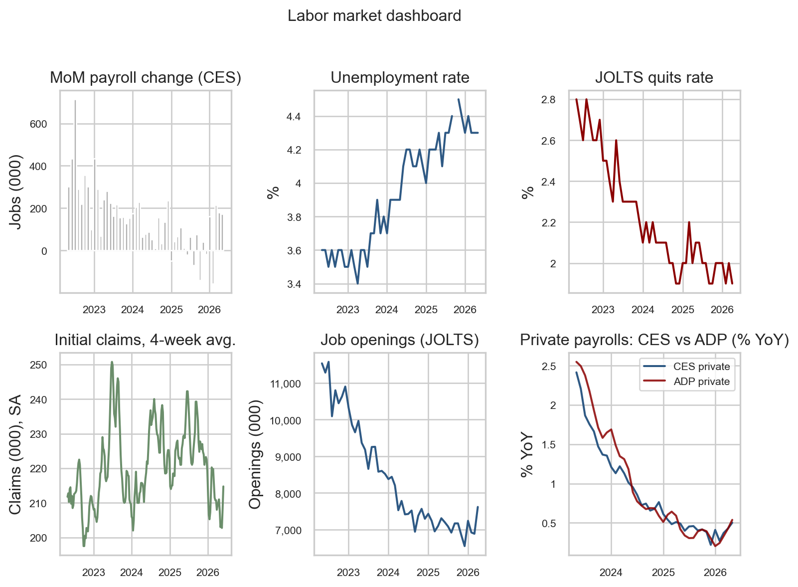
2. The full labor dashboard
A single chart of payrolls cannot adjudicate whether the labor market is rebalancing or breaking. The dashboard below compresses six complementary indicators that, taken together, describe the cycle without overweighting any single survey.
The three data sources behind the panels
Current Employment Statistics (CES) is the BLS establishment survey of roughly 119,000 businesses and government agencies that produces the headline payroll number, hours, and wage detail. CES is the canonical jobs series the market reacts to on release day.
Job Openings and Labor Turnover Survey (JOLTS) is a separate BLS survey of about 21,000 establishments that measures unfilled openings, hires, quits, and layoffs. JOLTS turns the labor market into a flow problem rather than a stock photo: openings tell you where firm-side demand is going, and the quits rate tells you how confident workers feel about their alternatives.
ADP National Employment Report is a private, independent count built from the actual payroll records of roughly 26 million workers processed by Automatic Data Processing (ADP), the company that pays them. ADP is the cleanest non-BLS cross-check for whether the establishment survey is telling the same story the private-sector microdata tells.
Together with weekly initial unemployment claims from the state offices that file them under the Department of Labor program, these sources let us read the cycle from four different angles: jobs added (CES), workers flowing in and out (JOLTS), independent payroll counts (ADP), and the highest-frequency early-warning signal (claims).
Show code
# =============================================================================# FIGURE 2: SIX-PANEL LABOR MARKET DASHBOARD# What the chart says: each cell is a different lens on the same labor market.# Reading them together is the antidote to overreacting to any single number,# which is what the headline payrolls beat-or-miss narrative encourages.# =============================================================================# A 2x3 grid keeps the panels readable inline. We do not share x-axes because# the bottom-left claims panel is weekly while the others are monthly; trying# to share would either compress the weekly panel or stretch the monthly ones.end = pay.index.max()start = end - pd.DateOffset(months=48)fig, axes = plt.subplots(2, 3, figsize=(8, 6), sharex=False)# Top-left: monthly payroll changes (the headline series). Grey bars# deliberately recede so the eye picks up the level rather than month noise.mom_ds = mom.loc[start:end]shade_recessions(axes[0, 0], start, end)axes[0, 0].bar(mom_ds.index, mom_ds.values, width=22, color=COLORS["light"])axes[0, 0].set_title("MoM payroll change (CES)")axes[0, 0].set_ylabel("Jobs (000)")# Top-middle: unemployment rate. The pandemic spike has long since dropped# off this 48-month window, leaving the post-2022 path in clear view.u = S("unrate").loc[start:end]shade_recessions(axes[0, 1], start, end)axes[0, 1].plot(u.index, u.values, color=COLORS["primary"])axes[0, 1].set_title("Unemployment rate")axes[0, 1].set_ylabel("%")# Top-right: JOLTS quits rate. Quits are a clean read on worker confidence# because people quit when they think they can find a better job.q = S("jolts_quits").loc[start:end]shade_recessions(axes[0, 2], start, end)axes[0, 2].plot(q.index, q.values, color=COLORS["accent"])axes[0, 2].set_title("JOLTS quits rate")axes[0, 2].set_ylabel("%")# Bottom-left: initial claims, four-week moving average. Claims are weekly# and noisy; the 4-week average is the standard smoothing convention used# by Treasury and Fed staff.cl = S("claims")cl = cl.loc[cl.index >= (start - pd.DateOffset(months=1))]cl_ma = cl.rolling(4, min_periods=4).mean()# ICSA is published in persons; divide by 1000 so the y-axis reads "Claims# (000), SA" correctly (i.e., 215 on the axis = 215,000 claims).axes[1, 0].plot(cl_ma.index, cl_ma.values /1000.0, color=COLORS["secondary"])axes[1, 0].set_title("Initial claims, 4-week avg.")axes[1, 0].set_ylabel("Claims (000), SA")# Bottom-middle: JOLTS job openings, the firm-side demand signal.jo = S("jolts_openings").loc[start:end]shade_recessions(axes[1, 1], start, end)axes[1, 1].plot(jo.index, jo.values, color=COLORS["primary"])axes[1, 1].set_title("Job openings (JOLTS)")axes[1, 1].set_ylabel("Openings (000)")# Bottom-right: CES vs. ADP private payrolls in YoY %. We compare YoY growth# rather than levels because the two series have different absolute levels# (concept and benchmarking differences); growth rates strip that out.priv = S("private_payrolls")adp = S("adp_private")yp = yoy_pct(priv.loc[start:end])ya = yoy_pct(adp.loc[start:end])axes[1, 2].plot(yp.index, yp.values, label="CES private", color=COLORS["primary"])axes[1, 2].plot(ya.index, ya.values, label="ADP private", color=COLORS["accent"], alpha=0.85)axes[1, 2].set_title("Private payrolls: CES vs ADP (% YoY)")axes[1, 2].legend(fontsize=8, loc="upper right")axes[1, 2].set_ylabel("% YoY")# Tidy date formatting on every panel. The y-tick formatter adds a thousand# separator only when the magnitude crosses 1,000, so percent panels keep# their decimal labels unchanged while claims/openings get readable commas.fmt_k = FuncFormatter(lambda x, _: f"{int(x):,}"ifabs(x) >=1000elsef"{x:g}")for ax in axes.ravel(): ax.xaxis.set_major_locator(mdates.YearLocator(1)) ax.xaxis.set_major_formatter(mdates.DateFormatter("%Y")) ax.yaxis.set_major_formatter(fmt_k) ax.tick_params(axis="x", labelsize=8) ax.tick_params(axis="y", labelsize=8)fig.suptitle("Labor market dashboard", fontsize=12, y=1.02)plt.tight_layout()# Save this panel as the canonical og:image for the post (it's the most# information-dense view and the one used in social previews).fig.savefig(IMG_DIR /"may-2026-labor-dashboard.png", dpi=300, bbox_inches="tight")plt.show()
Figure 2: Six-panel labor market dashboard covering the last 48 months: payrolls, unemployment, quits, claims, openings, and a CES-vs-ADP private-employment cross-check. source: BLS via FRED; ADP via FRED (ADPMNUSNERSA).
Reading the dashboard
Walking the panels top-to-bottom, left-to-right:
The top-left bars show the recent volatility: a few negative months scattered through late 2025, the February dip, but the most recent three bars are positive, consistent with stabilization rather than continued deceleration. Any single bar, however, should be read against the ±130,000 sampling-error context the callout above establishes.
The top-middle unemployment rate has stayed within a 4.3% band for several months. A stable unemployment rate while hiring continues at a slower pace is the textbook signature of a labor market that is rebalancing, not breaking - if firms were actually shedding workers, this line would already be moving up.
The top-right quits rate has settled near 2%, which is roughly the pre-pandemic norm. Workers quit when they think they can find a better job, so this is what a calm labor market looks like, not a scared one. The line stopped falling several months ago.
The bottom-left four-week initial claims line sits in the 215,000 neighborhood - well inside the 200,000-250,000 band historically associated with a healthy labor market. If the economy were actually turning, claims is the first place we would see it, and we do not.
The bottom-middle job-openings line has fallen from a 12 million peak in 2022 to about 7 million today, but it has been flat-to-rising for several months. Firms still want workers; the post-pandemic frenzy is over but demand has not collapsed.
The bottom-right panel is the cross-check on the BLS print: it overlays year-over-year private payroll growth from BLS (CES, blue) and from ADP’s independent payroll-processing data (red). The two lines decelerated together from about 2.5% to under 1% through 2024-25 and have moved sideways since - directionally consistent with the BLS read of stabilization, though year-over-year overlays will mechanically co-move because both are slow aggregates. The monthly scatter in Section 5 is the more granular view, and it shows more dispersion than the YoY overlay suggests.
Read together and on a trend basis, every panel reads stable rather than breaking, and the recent direction in payrolls and the employment-to-population ratio leans slightly firmer. That is the cleanest read, though not the only one - Section 3 will show that the composition of the headline tells a more nuanced story.
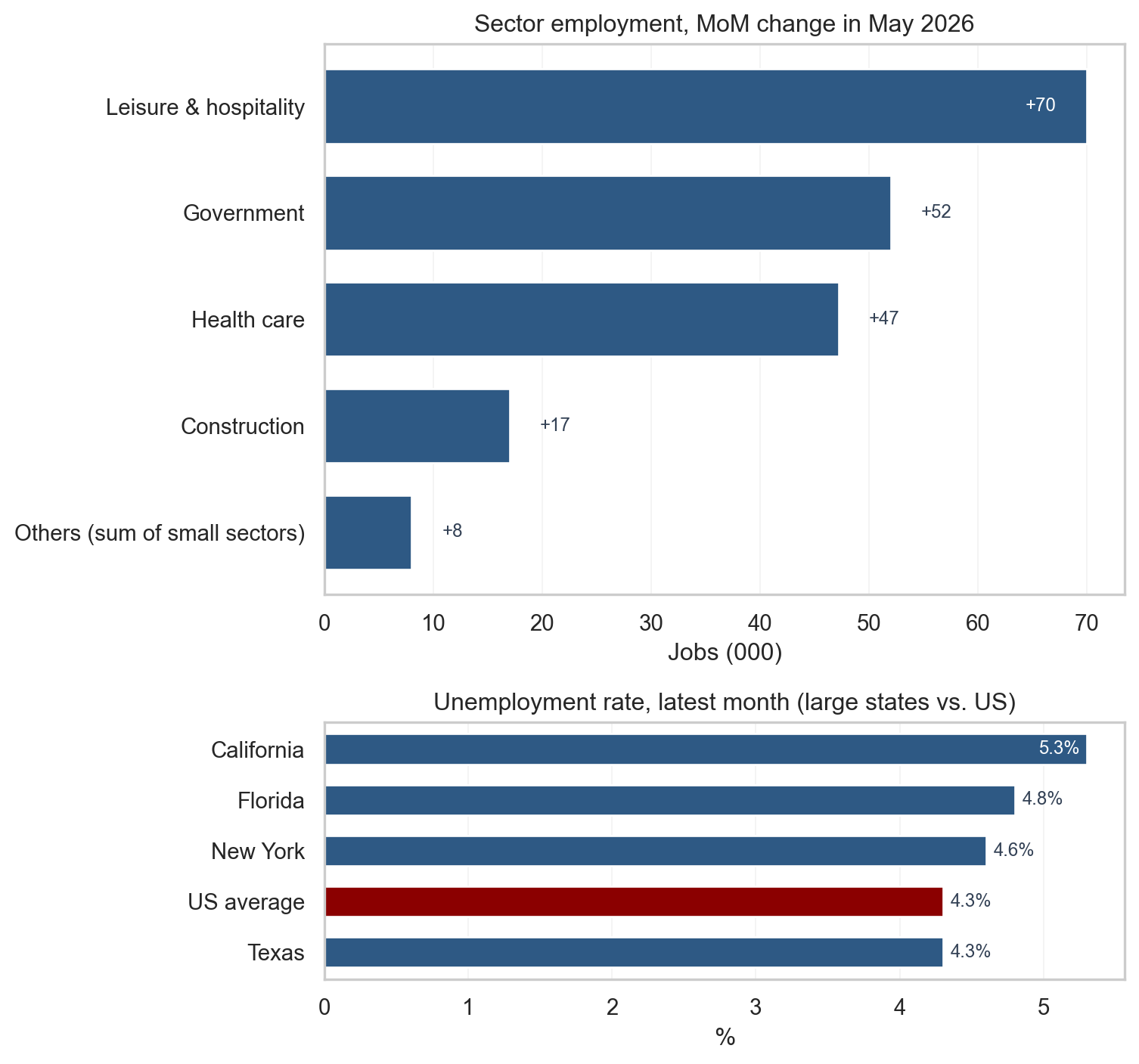
3. Sectoral and geographic divergences
The headline is misleading without the sector detail. Three sectors carried nearly the entire print: leisure and hospitality (+70,000), government (+52,000), and health care (+47,000) sum to roughly +169,000 of the +172,000 headline. Outside those three, construction added +17,000, but cyclical service sectors - manufacturing (+7,000), professional and business services (+6,000), information (-2,000), and trade, transportation, and utilities (-3,000) - were collectively at stall speed, and the remaining smaller supersectors (financial activities, other services, mining/logging, and the non-health portion of education and health services) netted slightly negative. Private cyclical demand is not contributing meaningfully to the May print.
That concentration matters. Health care and government are among the most acyclical sectors in the economy - health care follows demographics and insurance coverage, not the business cycle, and government employment is driven by fiscal budgets rather than private demand. The government number (+52,000) breaks down as federal +1,000 and state/local +51,000 - nearly all of the government hiring was at the state and local level, with federal employment essentially flat despite the 2025-26 federal workforce backdrop. Leisure and hospitality is more cyclically sensitive, but its +70,000 print continues a catch-up from the pandemic-era deficit.
This composition is a yellow flag, not a red one. Stabilization is real - the headline is positive, claims are contained, the unemployment rate is flat - but the breadth of that stabilization is narrow. Sustained reliance on acyclical sectors would signal weaker underlying private demand. If the acyclical sectors were removed, private cyclical hiring is running near zero, which is the kind of composition that can precede a broader softening if it persists. The chart below makes the concentration visible.
The bottom panel shows the latest unemployment rate for California, Texas, New York, and Florida against the US average. The four largest states sit in a tight band around the national figure, which means regional labor markets are not dramatically decoupled from the national picture even where industry mix differs. Divergences at the state level typically reflect that industry mix and migration flows rather than a separate national cycle.
Show code
# =============================================================================# FIGURE 3: HORIZONTAL SECTOR MoM (TOP) AND LARGE-STATE UR (BOTTOM)# What the chart says: where the headline payroll number actually came from# (sector detail) and whether the regional picture matches the national# read (large states vs. US). Two horizontal panels read top-to-bottom like# a list, which is more legible than vertical bars when names are long.# =============================================================================# ----- Top panel: May sector MoM with small sectors aggregated as "Others"sector_keys = ["construction","manufacturing","trade_trans_util","prof_bus","health_care","leisure","information","government",]may = pd.Timestamp("2026-05-01")april = may - pd.DateOffset(months=1)# Build a tidy table of {sector_label: May MoM in 000} for each available# series, computed directly from the FRED levels at april and may.sector_label = {"construction": "Construction","manufacturing": "Manufacturing","trade_trans_util": "Trade, transp. & utilities","prof_bus": "Professional & business","health_care": "Health care","leisure": "Leisure & hospitality","information": "Information","government": "Government",}sector_mom = {}for sk in sector_keys: s = S(sk)if may in s.index and april in s.index: sector_mom[sector_label[sk]] =float(s.loc[may] - s.loc[april])ser = pd.Series(sector_mom)# "Others" bucket: anything with absolute change < 10 (000 jobs) gets pooled.# This collapses the noise into one bar so the actual signal stands out.SMALL =10.0big = ser[ser.abs() >= SMALL]small = ser[ser.abs() < SMALL]iflen(small) >0: big["Others (sum of small sectors)"] =float(small.sum())# Sort ascending so the largest positive contribution sits at the top.big = big.sort_values(ascending=True)# Color positive bars in the primary blue, negatives in the accent red.bar_colors = [COLORS["accent"] if v <0else COLORS["primary"] for v in big.values]# ----- Bottom panel: large-state UR plus the US averagestate_keys = [("ca_unrate", "California"), ("tx_unrate", "Texas"), ("ny_unrate", "New York"), ("fl_unrate", "Florida")]state_ur = {}for sk, name in state_keys: ssr = S(sk).dropna() state_ur[name] =float(ssr.iloc[-1])state_ur["US average"] =float(S("unrate").dropna().iloc[-1])ur_ser = pd.Series(state_ur).sort_values(ascending=True)# Two stacked panels with different relative heights: the sector list is# tall (8-9 rows), the state list is short (5 rows), so unequal heights via# height_ratios keeps both legible.fig, (ax_top, ax_bot) = plt.subplots(2, 1, figsize=(8, 7.5), gridspec_kw={"height_ratios": [3.0, 1.4]},)# Top: sector horizontal barsax_top.barh(big.index, big.values, color=bar_colors, edgecolor="white", height=0.7)ax_top.axvline(0, color="#94a3b8", linewidth=0.8)ax_top.set_title("Sector employment, MoM change in May 2026")ax_top.set_xlabel("Jobs (000)")ax_top.grid(axis="x", alpha=0.25, linewidth=0.6)ax_top.grid(axis="y", visible=False)ax_top.set_axisbelow(True)# Value labels at the end of each bar, offset by a small amount so the# label does not overlap the bar. Each side of zero has its own threshold# so an asymmetric distribution (lots of positives, one small negative)# still flips the extreme bars to INSIDE-the-bar placement.xpad =max(big.abs()) *0.04pos_max = big[big >0].max() if (big >0).any() else0neg_max =abs(big[big <0].min()) if (big <0).any() else0for i, v inenumerate(big.values): txt =f"{v:+.0f}" near_right_edge = v >0and pos_max >0and v >=0.85* pos_max near_left_edge = v <0and neg_max >0andabs(v) >=0.85* neg_maxif near_right_edge: ax_top.text(v - xpad, i, txt, va="center", ha="right", fontsize=9, color="white")elif near_left_edge: ax_top.text(v + xpad, i, txt, va="center", ha="left", fontsize=9, color="white")elif v >=0: ax_top.text(v + xpad, i, txt, va="center", ha="left", fontsize=9, color="#334155")else: ax_top.text(v - xpad, i, txt, va="center", ha="right", fontsize=9, color="#334155")# Bottom: state UR horizontal bars, with US average highlighted.state_colors = [COLORS["accent"] if name =="US average"else COLORS["primary"]for name in ur_ser.index]ax_bot.barh(ur_ser.index, ur_ser.values, color=state_colors, edgecolor="white", height=0.6)ax_bot.set_title("Unemployment rate, latest month (large states vs. US)")ax_bot.set_xlabel("%")ax_bot.grid(axis="x", alpha=0.25, linewidth=0.6)ax_bot.grid(axis="y", visible=False)ax_bot.set_axisbelow(True)ur_max = ur_ser.max()for i, v inenumerate(ur_ser.values):if v >=0.95* ur_max: ax_bot.text(v -0.05, i, f"{v:.1f}%", va="center", ha="right", fontsize=9, color="white")else: ax_bot.text(v +0.05, i, f"{v:.1f}%", va="center", ha="left", fontsize=9, color="#334155")plt.tight_layout()fig.savefig(IMG_DIR /"may-2026-sector-mom.png", dpi=300, bbox_inches="tight")plt.show()
Figure 3: Top: May 2026 sector employment change, sectors below 10,000 jobs aggregated as ‘Others’ so the largest contributors stand out. Bottom: latest unemployment rate for the four most populous states against the US average. source: BLS via FRED (CES supersector aliases; CAUR, TXUR, NYUR, FLUR; UNRATE).
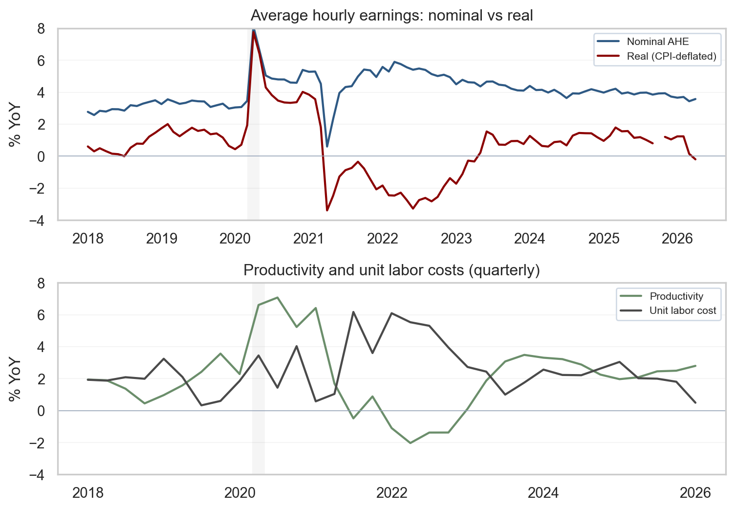
4. Wages, productivity, and the inflation link
Average hourly earnings (AHE) for all employees on private payrolls rose 0.3% month over month to $37.53, with year-over-year growth at 3.4%. AHE is the BLS measure of total wages and salaries divided by total paid hours - the simplest, fastest-arriving wage gauge in the monthly release. The first panel below plots nominal and real year-over-year changes in AHE, deflating earnings by CPI before computing the YoY growth so that real purchasing power can be read directly. The second panel overlays nonfarm business productivity and unit labor costs (ULC) at quarterly frequency - the cleanest macro series for tracking the wage-inflation link.
The intuition for markets is straightforward. If nominal wage growth runs near productivity plus the Fed’s 2% inflation target, unit labor cost pressure stays contained and pricing models do not require a services-inflation correction. When nominal wages outrun productivity for sustained periods, services pricing models begin to allow for more persistence unless margins absorb the difference. A useful caution: AHE is a composition-sensitive measure - mix shifts across industries and skill levels move the aggregate even when individual wage schedules are stable. Pairing AHE with productivity and ULC at the business-sector level handles some of those composition effects differently than a simple division of payrolls by hours.
Show code
# =============================================================================# FIGURE 4: WAGES (NOMINAL vs. REAL) AND PRODUCTIVITY/UNIT LABOR COSTS# What the chart says: nominal wages tell you nothing about purchasing power;# real wages do. And the sustainable level of nominal wage growth depends on# productivity. Two stacked panels hold those two ideas side by side.# =============================================================================# Top panel: align AHE and CPI on a monthly index so the deflation step is# point-by-point, then compute YoY for both nominal and real series.earn = S("earnings_all")cpi = S("cpi")dfw = pd.concat([earn, cpi], axis=1, join="inner")dfw.columns = ["earn", "cpi"]# Real wage index: nominal level / CPI level, scaled by 100 to put it on a# familiar index basis (the absolute level does not matter for the YoY).dfw["real"] = dfw["earn"] / dfw["cpi"] *100.0dfw["nom_yoy"] = dfw["earn"].pct_change(12, fill_method=None) *100.0dfw["real_yoy"] = dfw["real"].pct_change(12, fill_method=None) *100.0dfw = dfw.loc["2018-01-01":]# Bottom panel: productivity and ULC are quarterly; pct_change(4) gives a YoY# growth rate (4 quarters back).prod = S("productivity")ulc = S("ulc")dqp = pd.concat([prod, ulc], axis=1, join="inner")dqp.columns = ["prod", "ulc"]dqp["prod_yoy"] = dqp["prod"].pct_change(4, fill_method=None) *100.0dqp["ulc_yoy"] = dqp["ulc"].pct_change(4, fill_method=None) *100.0dqp = dqp.loc["2018-01-01":]# Shorter figure than before so each panel is dense rather than stretched.fig, (ax1, ax2) = plt.subplots(2, 1, figsize=(8, 5.6), sharex=False)# Top: nominal vs. real wages, with recession shading for context.shade_recessions(ax1, dfw.index.min(), dfw.index.max())ax1.plot(dfw.index, dfw["nom_yoy"], label="Nominal AHE", color=COLORS["primary"], linewidth=1.6)ax1.plot(dfw.index, dfw["real_yoy"], label="Real (CPI-deflated)", color=COLORS["accent"], linewidth=1.6)ax1.axhline(0, color="#94a3b8", linewidth=0.6)# Hard y-limits so the post-2022 path is the visible story rather than the# 2020-21 pandemic spike. Picked to comfortably contain the standing data.ax1.set_ylim(-4, 8)ax1.set_ylabel("% YoY")ax1.set_title("Average hourly earnings: nominal vs real")ax1.legend(loc="upper right", fontsize=8, frameon=True, framealpha=0.9, edgecolor="#cbd5e1")ax1.grid(axis="y", alpha=0.25, linewidth=0.6)ax1.grid(axis="x", visible=False)ax1.set_axisbelow(True)# Bottom: productivity and ULC.shade_recessions(ax2, dqp.index.min(), dqp.index.max())ax2.plot(dqp.index, dqp["prod_yoy"], label="Productivity", color=COLORS["secondary"], linewidth=1.6)ax2.plot(dqp.index, dqp["ulc_yoy"], label="Unit labor cost", color=COLORS["neutral"], linewidth=1.6)ax2.axhline(0, color="#94a3b8", linewidth=0.6)ax2.set_ylim(-4, 8)ax2.set_ylabel("% YoY")ax2.set_title("Productivity and unit labor costs (quarterly)")ax2.legend(loc="upper right", fontsize=8, frameon=True, framealpha=0.9, edgecolor="#cbd5e1")ax2.xaxis.set_major_formatter(mdates.DateFormatter("%Y"))ax2.xaxis.set_major_locator(mdates.YearLocator(2))ax2.grid(axis="y", alpha=0.25, linewidth=0.6)ax2.grid(axis="x", visible=False)ax2.set_axisbelow(True)plt.tight_layout()fig.savefig(IMG_DIR /"may-2026-wages-productivity.png", dpi=300, bbox_inches="tight")plt.show()
Figure 4: Top: nominal and CPI-deflated AHE, year over year. Bottom: nonfarm business productivity and unit labor costs, year over year (quarterly). source: BLS via FRED (CES0500000003, CPIAUCSL, OPHNFB, ULCNFB).
What the wage panels are telling you
The top panel answers the question every worker asks: is your raise keeping up with prices? Nominal AHE (blue) is growing about 3.4% year over year, while real AHE (red, after taking CPI out) is meaningfully positive - workers are getting raises, and after the inflation pass-through their purchasing power is still rising, just modestly. When the red line was below zero in 2021-22, real wages were actually falling; the fact that it has been above zero through 2024-26 is the (slow) repair of pandemic-era purchasing-power losses.
The bottom panel answers the question the Fed cares about: is the wage path sustainable for prices? Productivity (green) growing faster than unit labor costs (gray) is the green light, because firms can pay higher wages without raising their own prices to offset. Today productivity is running near 2-3% YoY while unit labor costs are near 1-2%, which is inside the sustainable zone. A caveat: OPHNFB and ULCNFB are among the most heavily revised series in macro, and a couple of quarters of readings should be held lightly - the picture can shift materially with the next annual revision. When the gray line is above the green line (as it was in 2022), unit-cost pressure builds and the inflation hand-off from wages gets harder to contain.
The light gray vertical bars on both panels mark NBER-dated US recessions. In this window the only one is the short 2020 COVID recession; it is shown so the reader can compare today’s wage and productivity readings to a known downturn rather than to a blank background.
5. Cross-checks: ADP and initial claims
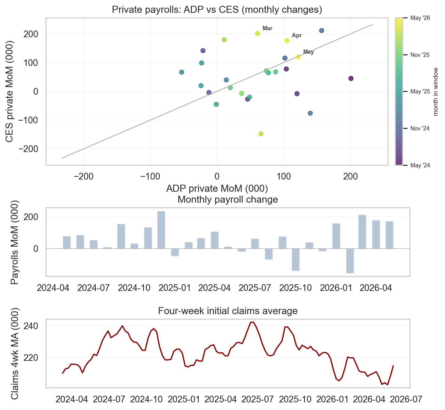
When the establishment and household surveys disagree, the right move is to consult independent sources. The two best high-frequency cross-checks are the ADP National Employment Report (a separate private-sector payroll measure built from real payroll-processing data) and initial unemployment claims (a weekly count from state UI offices, available on a one-week lag). ADP is model-assisted and has a poor month-to-month track record against CES - its value is directional rather than precise, and the scatter in the top panel below shows more dispersion than a tight “confirmation” would require. Neither source is a substitute for the BLS survey, but together they help reject the most extreme interpretations of any single month.
The figure below shows three views. In the top panel, each dot is one month from the last 24, positioned by the ADP private change (x-axis) against the BLS private change (y-axis), colored from dark purple (earliest) to bright yellow (most recent). Dots near the 45-degree line agree; dots off the line disagree. The dispersion is meaningful - the two sources diverge substantially in many months - but the most recent dots sit in the positive quadrant, directionally consistent with the May BLS read.
The middle and bottom panels separate the two series whose joint movement would be the most reliable downturn signal - payroll bars and the four-week claims average - onto independent axes, so the visual relationship is not an artifact of scaling choice. In a real downturn, payroll bars would tip persistently negative AND the claims line would step up. Today: bars are averaging positive again after the April scare while claims sit flat in the 215,000 neighborhood. That is the visual signature of stabilization at a slower-but-positive trend.
Show code
# =============================================================================# FIGURE 5: ADP-vs-CES SCATTER AND PAYROLLS + CLAIMS SMALL-MULTIPLE# What the chart says: independent sources are directionally consistent with# the BLS read. ADP tracks CES with meaningful dispersion (top). Payrolls# and claims are shown on independent axes (middle and bottom) so the reader# can judge each series on its own terms without hand-pinned dual-axis# scaling that can manufacture or erase a visual relationship.# =============================================================================# Restrict to the last 24 months so the scatter is dense enough to see# structure but not so long that the relationship's evolution is washed out.end = pay.index.max()start24 = end - pd.DateOffset(months=24)priv = S("private_payrolls")adp = S("adp_private")pm = priv.diff()am = adp.diff()scat = (pd.concat([pm.rename("ces"), am.rename("adp")], axis=1, join="inner") .loc[start24:end].dropna())cl = S("claims")clm = cl.rolling(4, min_periods=4).mean().loc[start24 - pd.DateOffset(weeks=8):]fig, (axs, axb, axc) = plt.subplots(3, 1, figsize=(8, 8.2), gridspec_kw={"height_ratios": [1.5, 0.7, 0.7],"hspace": 0.45})# --- Top panel: scatter colored by time ---sc = axs.scatter(scat["adp"], scat["ces"], c=range(len(scat)), cmap="viridis", s=28, alpha=0.75)axs.set_xlabel("ADP private MoM (000)")axs.set_ylabel("CES private MoM (000)")axs.set_title("Private payrolls: ADP vs CES (monthly changes)")axs.grid(alpha=0.25, linewidth=0.6)axs.set_axisbelow(True)# Colorbar with quarterly tick labels so intermediate months are readable.cbar = fig.colorbar(sc, ax=axs, fraction=0.04, pad=0.02)n_ticks =min(5, len(scat))tick_positions = np.linspace(0, len(scat) -1, n_ticks).astype(int)cbar.set_ticks(tick_positions)cbar.set_ticklabels([scat.index[i].strftime("%b '%y") for i in tick_positions])cbar.ax.tick_params(labelsize=7)cbar.set_label("month in window", fontsize=8)# Annotate the 3 most recent dots with month labels for trajectory.for i inrange(-3, 0): row = scat.iloc[i] lbl = scat.index[i].strftime("%b") axs.annotate(lbl, (row["adp"], row["ces"]), textcoords="offset points", xytext=(6, 4), fontsize=7, color=COLORS["neutral"], fontweight="bold")# 45-degree reference line: identical changes would fall on this diagonal.lims =max(np.nanmax(np.abs(scat["adp"])), np.nanmax(np.abs(scat["ces"])), 100) *1.1axs.plot([-lims, lims], [-lims, lims], color=COLORS["light"], linewidth=1)# --- Middle panel: payroll bars (independent y-axis) ---payroll_window = mom.loc[start24:end]axb.bar(payroll_window.index, payroll_window.values, width=18, alpha=0.35, color=COLORS["primary"])axb.axhline(0, color=COLORS["neutral"], linewidth=0.5, alpha=0.5)axb.set_ylabel("Payrolls MoM (000)")axb.set_title("Monthly payroll change")axb.xaxis.set_major_formatter(mdates.DateFormatter("%Y-%m"))axb.grid(axis="y", alpha=0.25, linewidth=0.6)axb.grid(axis="x", visible=False)axb.set_axisbelow(True)# --- Bottom panel: claims line (independent y-axis) ---axc.plot(clm.index, clm.values /1000, color=COLORS["accent"], linewidth=1.5)axc.set_ylabel("Claims 4wk MA (000)")axc.set_title("Four-week initial claims average")axc.xaxis.set_major_formatter(mdates.DateFormatter("%Y-%m"))axc.grid(axis="y", alpha=0.25, linewidth=0.6)axc.grid(axis="x", visible=False)axc.set_axisbelow(True)plt.tight_layout()fig.savefig(IMG_DIR /"may-2026-cross-checks.png", dpi=300, bbox_inches="tight")plt.show()
Figure 5: Top: scatter of ADP vs. CES private monthly changes (last 24 months) with 45-degree reference line. Middle & bottom: monthly payroll change and four-week initial claims average shown on separate axes to avoid scaling artifacts. source: BLS via FRED; ADP via FRED.
6. Market and Fed implications
For rate markets, May is one input among several arriving into the June 16 to 17, 2026 Federal Open Market Committee window, which will also carry an updated Summary of Economic Projections and dot plot. The Summary of Economic Projections translates staff forecasts and participant judgments into a simple picture of the expected policy path, and June meetings tend to draw more attention because they include a refresh of the dot plot. The May labor data feed the growth side of the reaction function, while the next major inflation print arrives on June 11, 2026 with the May CPI release.
Two practical observations for positioning. First, a payroll print above consensus does not, on its own, derail an easing path: if real wage growth and unit labor costs remain contained (panel 4), the inflation side of the mandate remains the binding constraint, not the labor side. The committee can still describe the labor market as “in better balance” and proceed with a measured-cut framework. Second, the 2-year vs. 10-year Treasury spread continues to embed both policy expectations and term premia, and a labor report that stabilizes without overheating is consistent with the dot-plot path of measured cuts later this year. The cross-checks in section 5 - ADP directionally consistent with CES and four-week claims contained - support reading May as a stabilization print rather than a re-acceleration that would trouble the inflation outlook, with the caveat that the sectoral concentration documented in section 3 is the single most important thing the committee will want to see broaden before leaning into a stronger labor narrative.
For a deeper dive on the April FOMC decision and the dot-plot framework, see the companion post on the April FOMC decision.
7. What it means
May reads as stabilization, but with three caveats that the careful reader has already met: the headline beat is within one CES confidence interval of consensus, the gains are concentrated in three acyclical sectors, and recent prints carry the largest revision risk. The unemployment rate is steady at 4.3%, the cross-checks are directionally consistent with the BLS read, and wage growth remains contained. None of that is overturned by the caveats - but the confidence level the headline alone would suggest is not the right one. Each constituency reads it a little differently.
For policymakers: the report does not, on its own, change the trajectory of policy. The labor market is no longer cooling fast enough to demand defensive cuts on growth grounds, but the narrow breadth of hiring is the kind of signal the committee will want to see broaden before it leans into a stronger labor read. AHE growth at 3.4% YoY and productivity gains keep unit labor cost pressure muted, though the productivity and ULC series are both heavily revised. The June 16 to 17, 2026 FOMC will see more information than this single print; the direction of travel - stabilizing hiring, contained claims - is consistent with the dot-plot path of measured cuts later in the year, but only if the breadth of hiring fills in beyond the three acyclical sectors that carried May.
For markets: positioning into the June 11, 2026 CPI release should account for the possibility that a stabilizing labor market and services inflation persistence can coexist. The 2-year vs. 10-year Treasury spread is the cleanest single read on whether traders are crediting the dot-plot path or fading it; May’s print is consistent with the configuration that has held for several weeks - front-end pricing modestly above the dots, long-end pricing reflecting term premia rather than panic. A headline payroll number well above consensus with contained wages is a benign mix for risk assets, even if the within-CI nature of the beat and the sector concentration warrant less of a directional move than the surface number alone implies.
For readers tracking the cycle: the next datapoint that will move the read is the June 11, 2026 CPI; the labor print after that is the June Employment Situation on July 2, 2026. Three specific items to watch:
Whether the 6-month payroll average (+92,000) catches up to the 3-month (+188,000), or whether the more recent strength reverses as preliminary prints are revised.
Whether the unemployment rate breaks the four-month plateau at 4.3% in either direction - the longer it holds, the more confidence the committee can take from the “in better balance” framing.
Whether breadth improves: whether cyclical sectors (manufacturing, professional/business services, information, trade) move off stall speed, or whether the next print again leans on health care, government, and leisure to carry the headline.
8. Conclusion
May was a stabilization print inside a clearly slower trend, but the stabilization is narrower than the headline suggests. Three sectors (leisure, government, and health care) accounted for nearly all of the +172,000 gain; private cyclical demand is running near zero. The household survey was directionally consistent but too noisy to count as confirmation. The upward revision to April is notable - the initial +115,000 print became +179,000 - but initial prints carry the largest revision risk, and recent annual CES benchmarks have been large and downward. Independent cross-checks are directionally consistent with the BLS read; wage and productivity dynamics suggest contained unit labor cost pressure, with the caveat that both series are heavily revised. The cycle is stabilizing at a slower pace, not breaking - but the breadth of that stabilization bears watching. The next markers - June 11, 2026 CPI, the June FOMC, and the June Employment Situation on July 2, 2026 - will tell us whether the framing holds.
Code and data: all analysis was performed in Python using data from FRED. Full scripts and CSV files are available in the GitHub repository under posts/2026-06-06-may-2026-jobs-report-stabilization/.